Why change enablement should be a tech design requirement
There are a lot of factors that go into the design process; practicality, UX and compatibility are some of them, but Change Enablement often gets left out of the equation. Here’s why – and how – this should change.

As we’ve discussed in previous posts, change management is a critical part of the way growth-oriented organizations should approach their employee experience, and the way the products and platforms they adopt and implement are built should reflect this.
But what does this integration look like?
We usually try to talk about broad ideas that are relevant to the entire industry on this blog – but in this case, we think our implementation of these principals really is the gold standard, and felt that the best way to present them is to just talk about what we do, and why we do it.
Instant Value
The most important thing about change management, from a user experience perspective, is proving value as quickly as possible. If a proposed change doesn’t immediately demonstrate its worth, the people who are meant to carry it out will find it more difficult to adopt it. From there, the way to it falling out of use entirely isn’t long.
For this reason, getting a meaningful experience from the platform as soon as possible is absolutely critical – but before the platform can offer meaningful opportunities and actionable items to its users, they need to be onboarded.
It’s because of this change management rationale that we spent a lot of time making sure it takes very little time to start seeing worthwhile interactions with our platform from the moment employees first come into contact with it.
How? By making sure our platform can extract as much information as it can from available resources (CVs, LinkedIn profiles and more) without any effort or time at the user’s expense, thereby drastically shortening the onboarding process.
How short? Users complete their profiles within 30 seconds of first signing in – and can immediately find highly-relevant, personalized recommendations and experiences once they’re done.
But that’s just the first stage – there are other factors which may make it more difficult for employees to embrace change, and we’ve addressed them as well.
A Non-Committal Approach
One of the biggest psychological hurdles on the way to adoption is commitment. Users may complete their profile within seconds, but their adoption process may run out of steam shortly after their lightning-quick onboarding process, if they’re worried their use of the platform will have real-world ramifications they can’t foresee. We wanted to let employees test the waters before they take the plunge – or at least, to feel like they can easily return to a safe harbor if things get out of hand.
For this reason, we’ve done two things: first, we’ve taken managerial approval out of the equation. Users’ interactions in Gloat’s Talent Marketplace are solely with the platform, not with managers. This lets them experiment and try out different things without getting into a position in which they have to explain themselves.
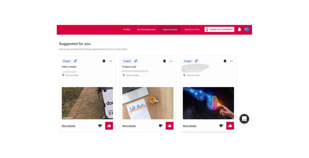
Second, we’ve created a “thumbs up, thumbs down” interface which leads to rewarding interactions quickly – without users having to commit to writing applications or marking specific preferences. This makes the employee’s experience much lighter, and unburdened with the labor usually involved with applying for a new position or project within the company. Since the experience is easy, adapting to the change that comes with it becomes easier, too.
But that isn’t enough; before change turns into routine, it needs to be encouraged.
Encouraging Use
After the initial hurdle of onboarding and tinkering with the system has been passed, it’s the system’s job to keep that inertia going. Users can complete a profile and try some things out, but then forget about the system completely and revert back to their old habits. For the new changes to truly take root, users need to be reminded and encouraged to continue using the system – so we’ve made sure we regularly send relevant email reminders and notifications about processes users have begun, or which we think might be relevant to them based on their profiles and history of use.
Anticipating Trouble
Since building up inertia towards change is such a sensitive undertaking, we wanted to make sure we can anticipate friction ahead of time, and deal with it before it becomes an issue.
If a user was trying to get something done and reached a point where they had to seek help, it’s already too late; their faith in the change the product is a part of is already shaken.
For this reason, we’ve instated a responsive support approach; we locate possible points of friction in the user interface the user experience through extensive BI analysis, and add helpful pop-ups that not only anticipate questions users might have, but which also tie back to and remind users of the benefits of the process, which they’ve originally been made aware of in change management efforts outside of the platform.
Adapting to Unique Requirements
The above are good catch-all approaches, but different companies have different needs, and a big part of change management-minded design is about making sure the system serves the specific needs and requirements of its users.
As change management is an integral part of the system, this needs to be reflected in the abilities given to executives, who know their company culture and workforce best, to shape and influence user experience at every scale and juncture.
In our case, this applies to everything, from governance tools which let admins group users based on organizational needs, to D&I officers providing input and critical human perspective for the platform’s AI-based matching algorithm.
What may work for most organizations can be counter-beneficial to others, and rather than help change, impede it. For this reason, we make sure each adopter is heavily involved in development from day one.


